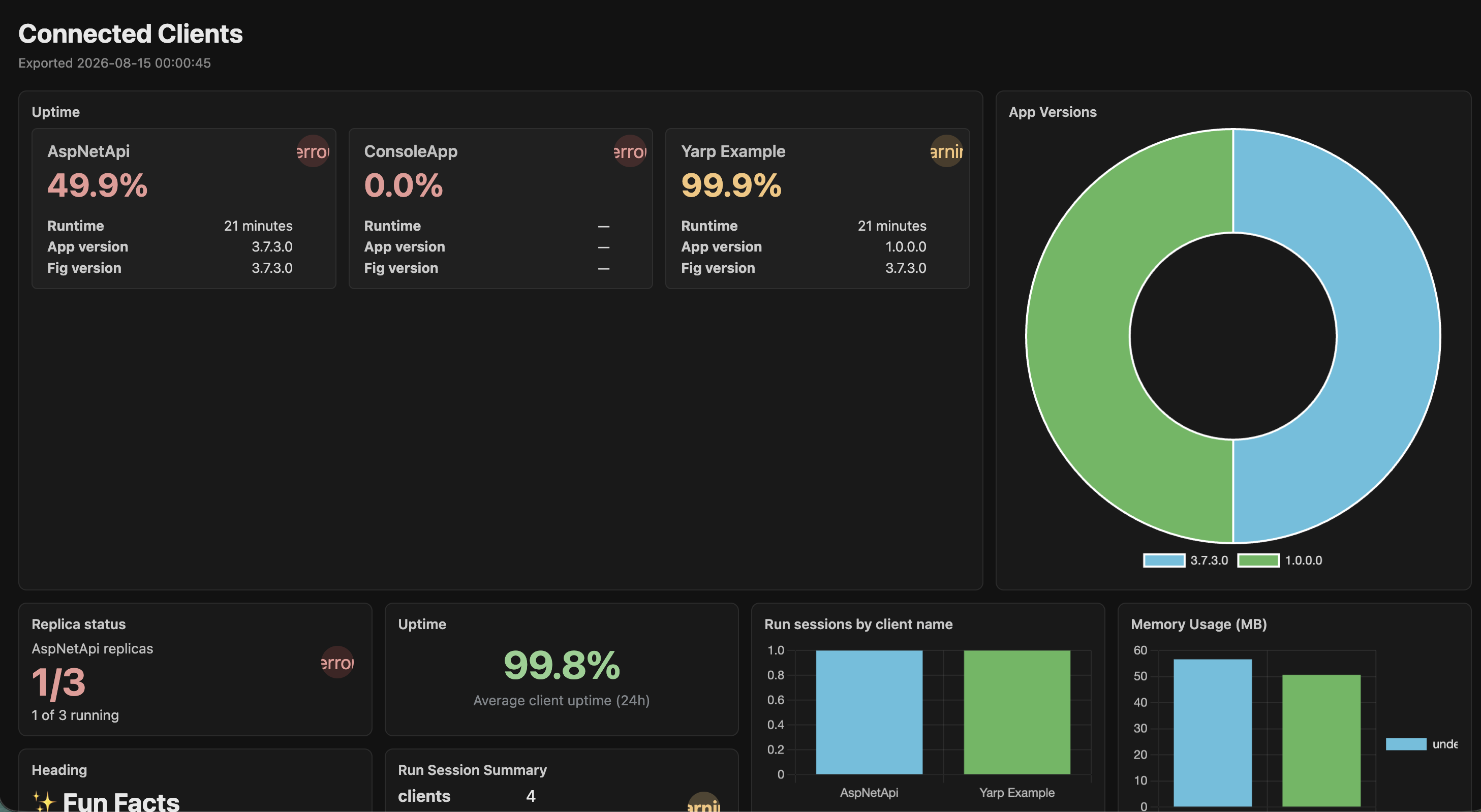
Dashboards
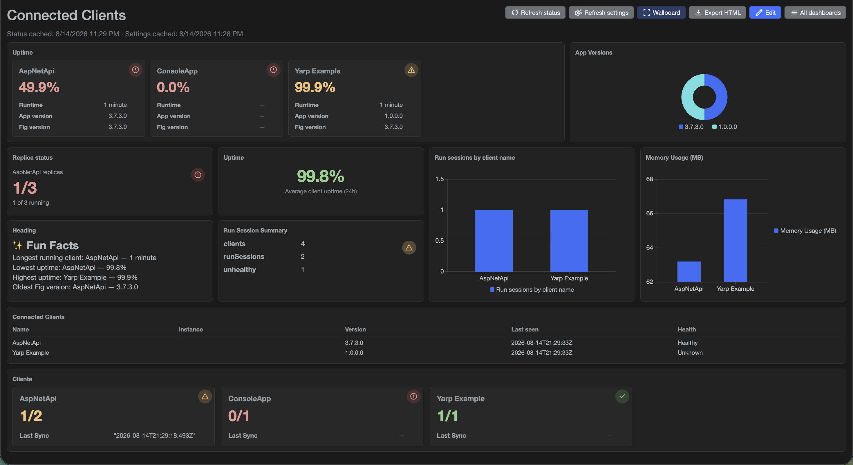
Dashboards are configurable, read-only views of Fig status and settings data. Use them for wallboards, operations boards, and fleet health summaries.
Each dashboard is a 12-column grid of trusted Fig UI components. Data for each component comes from a short inline JavaScript script that runs in the browser (via Jint). Scripts transform live Fig data (fig.clients and fig.runSessions) into the shape each component expects. Users cannot inject HTML or Razor—only data transformations.
Dashboards require JavaScript execution. If Allow JavaScript is disabled in Configuration, the Dashboards feature is unavailable (navigation, pages, and API). Enable that setting to use dashboards.

Who can use dashboards
| Action | Roles |
|---|---|
| View dashboards | Administrator, User, ReadOnly, Dashboard |
| Create, edit, delete, duplicate | Administrator only |
- Dashboards marked Admin only are hidden from non-administrators.
- Users with the Dashboard role are redirected to
/dashboardsafter login and only see the dashboards UI (not settings management). - See User Management for roles.
Getting started
- Open Dashboards from the main navigation (
/dashboards). - Click New Dashboard (administrators).
- Open Properties (gear icon) to set:
- Name and Description
- Admin only visibility
- Refresh intervals (status and settings—see Refresh)
- Click Edit to open the canvas editor.
- Add components from the left palette, place them on the grid, and bind data with suggested or custom scripts.
- Save, then Open (view) or enable Wallboard mode.
Editor
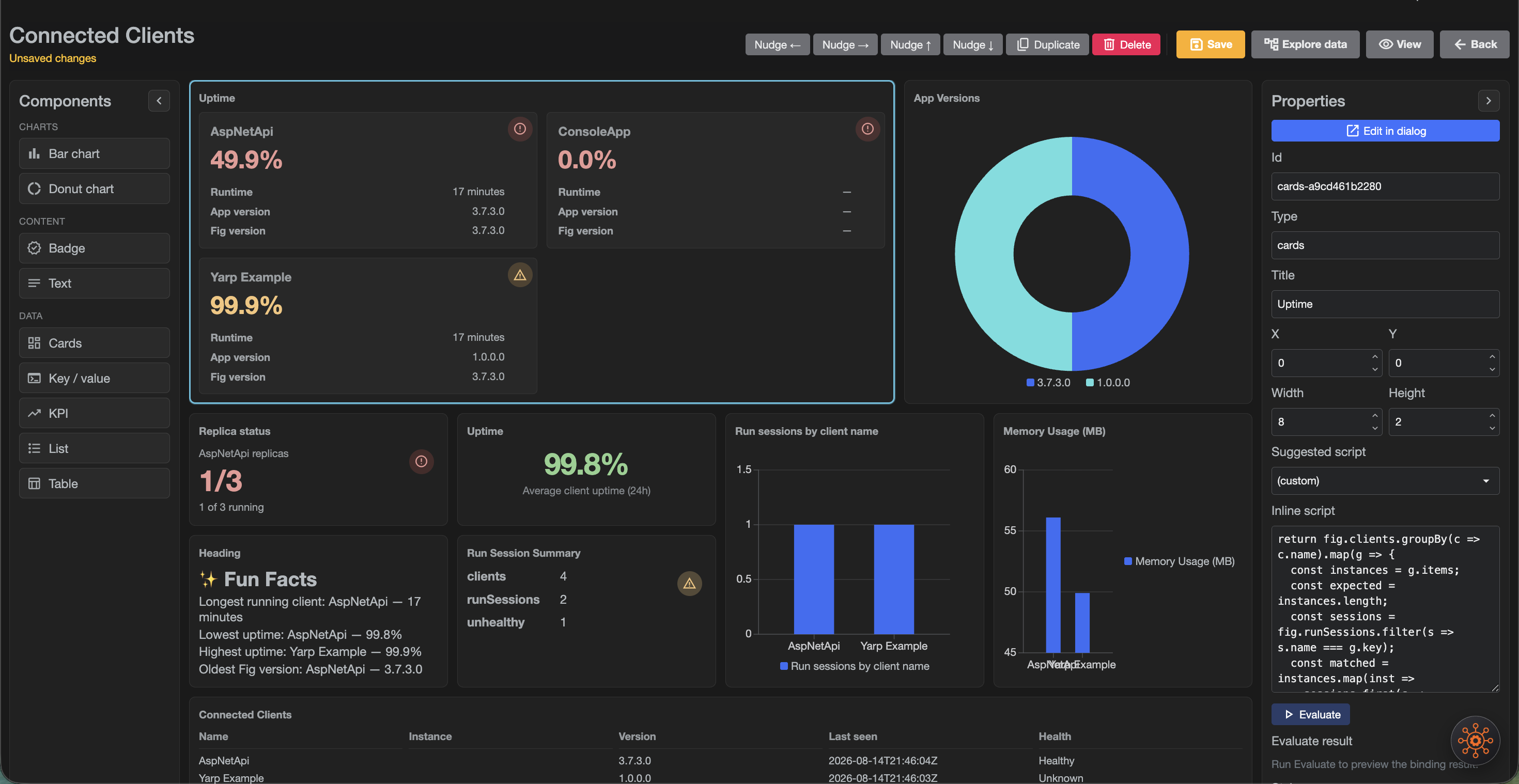
Layout
| Area | Purpose |
|---|---|
| Left palette | Component types (KPI, Text, Badge, charts, Table, List, Key/value, Cards). Panels collapse to free canvas space. |
| Center canvas | 12-column grid. Click a blank area to deselect. |
| Right properties | Selected component fields, suggested script, inline script, Evaluate. Collapse to free space. |
| Top toolbar | Save, View, Data explorer, nudge / duplicate / delete for the selection. |
Placing and editing components
- Click a palette item to add it; drag or use arrow keys / nudge buttons to move the selection.
- Double-click a component (or use Edit in the sidebar) to open the component edit dialog: all properties, a live preview, and a Monaco JavaScript editor with IntelliSense for
fig. - Changes in the dialog sync back to the sidebar when you close it.
- Scripts are evaluated when you press Evaluate or leave the script field—not on every keystroke.
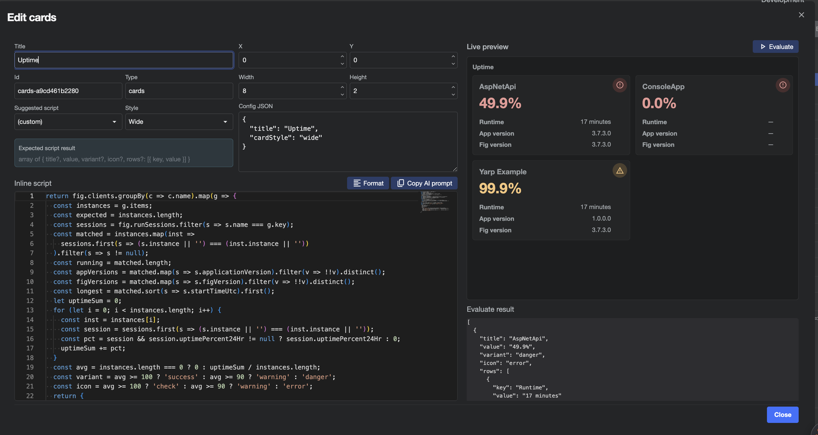
Data explorer
Use Data explorer (toolbar) to browse the live fig object tree. Each node has a copy control that copies the full JavaScript path (for example fig.runSessions[0].applicationVersion) so you can paste it into a script.
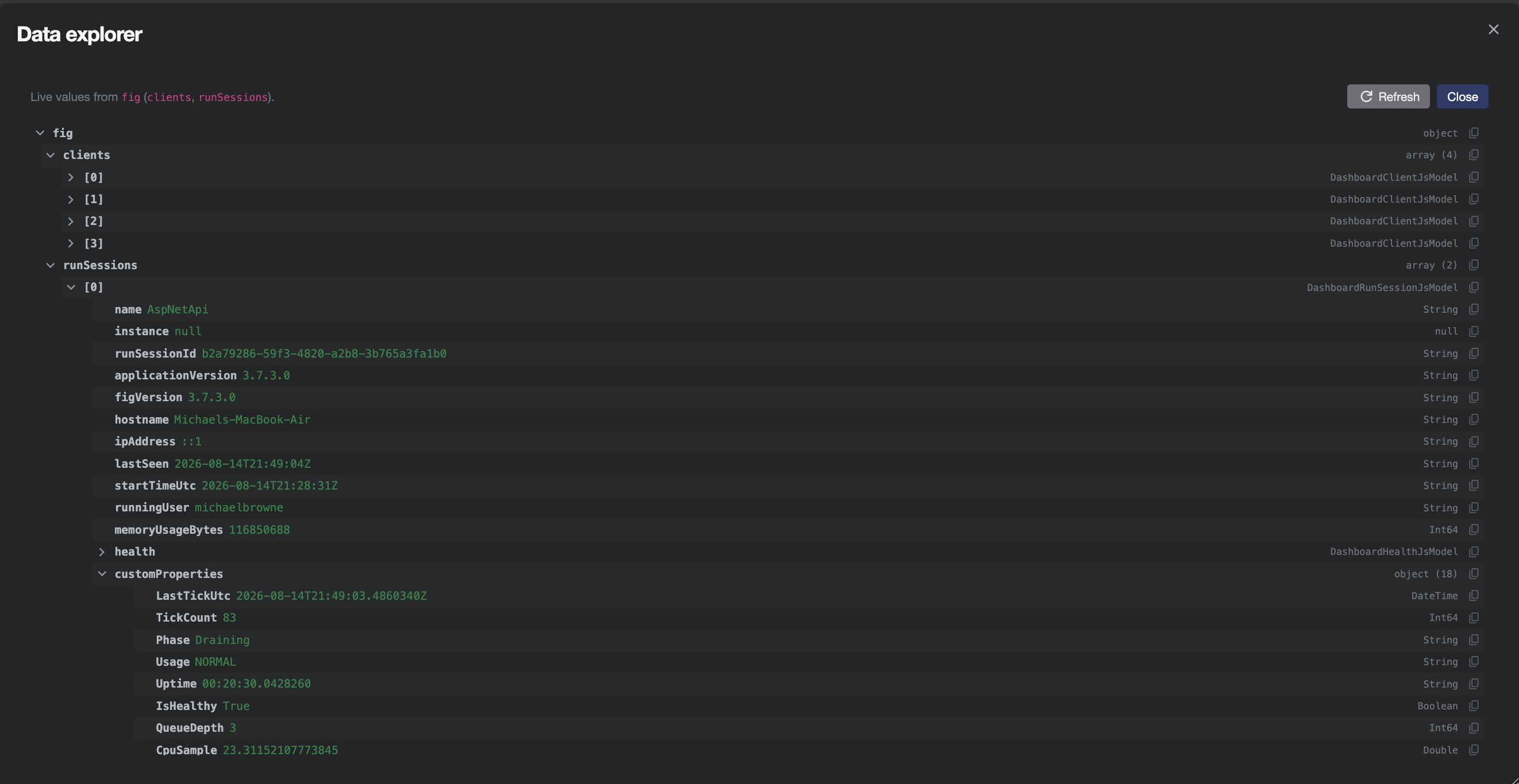
Fig Assistant and external AI
- With Fig Assistant configured, you can ask it to write or update the selected component’s inline script (dashboard-scoped actions only).
- Without Assistant, open the component edit dialog and use Copy AI prompt. Paste the prompt into any external AI, describe what you want the visualization to show, and paste the returned JavaScript (prefer a fenced
javascriptcode block) into Monaco. Use Format to beautify the script.
Viewer and wallboard
On the view page (/dashboards/{id}):
- Refresh status / Refresh settings — force-reload cached data used by scripts.
- Export HTML — download a static HTML snapshot (charts rendered with Chart.js). Secrets and live polling are not included.
- Wallboard — hides Fig chrome for a kiosk-friendly layout (
?wallboard=1). Click Wallboard / Exit wallboard again, or press Esc, to leave wallboard mode. - Edit — administrators return to the canvas.
Data model (fig)
Scripts receive a root object fig with two collections. Both are fluent arrays (not native JavaScript Array): they support indexing and helpers such as filter, map, groupBy, count, sum, first, last, sort, take, distinct, toArray. Prefer .length and .count(...) for counts—do not assume a CLR Count property.
fig.runSessions
One entry per connected run session (see also Connected Clients).
| Property | Type | Notes |
|---|---|---|
name | string | Client name |
instance | string? | Instance name when used |
runSessionId | string | Session id |
applicationVersion | string? | Host app version |
figVersion | string? | Fig.Client package version |
hostname | string? | |
ipAddress | string? | |
lastSeen | string? | |
startTimeUtc | string | |
runningUser | string | |
memoryUsageBytes | number | |
health | object | { status, components[] } — see Health Checks |
customProperties | object | Keys from Custom Status Properties |
uptimePercent24Hr | number? | Approximate rolling 24h client uptime (0–100); also shown as a hidden column on Connected Clients |
uptimeHuman | string | Humanized process runtime (for example "3 hours") |
fig.clients
Registered clients and non-secret setting values available to the current user (classification-filtered).
| Property | Type | Notes |
|---|---|---|
name | string | |
instance | string? | |
description | string | |
settings | object | Setting name → value |
Use Data explorer to see live keys under settings and customProperties for your environment. Monaco and the AI prompt also include dynamic typings for those keys when data is loaded.
Example helpers
// Sessions for one client
const sessions = fig.runSessions.filter(s => s.name === 'AspNetApi');

// Group and chart
return fig.runSessions
  .groupBy(s => s.health.status)
  .map(g => ({ label: g.key, value: g.items.length }));
Component reference
Every component is bound with an inline script that must return (or evaluate to) the expected shape. Use the Suggested script dropdown to load a working starter, then customize.
Shared visual variants where noted: normal | info | success | warning | danger (and muted for badges). Icons are Material icon names used by Radzen (for example check, warning, error).
KPI
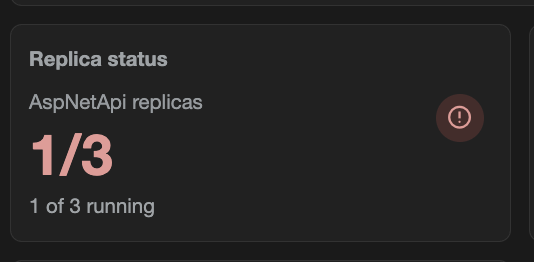
Large metric with optional label, subtitle, trend, coloured value, and status icon. Supports a single value or a numerator / denominator pair (displayed as 2/3).
Expected return
{
  value?: any,
  numerator?: number | string,
  denominator?: number | string,
  label?: string,
  subtitle?: string,
  trend?: string | number,
  variant?: 'normal' | 'info' | 'success' | 'warning' | 'danger',
  icon?: string
}
// or a primitive value
Suggested scripts
- Count run sessions
- Replica count status
return { value: fig.runSessions.length, label: 'Connected run sessions' };
const clientName = 'AspNetApi';
const expected = 3;
const warningAt = 2;
const sessions = fig.runSessions.filter(s => s.name === clientName);
const running = sessions.length;
const variant = running >= expected ? 'success' : running >= warningAt ? 'warning' : 'danger';
const icon = running >= expected ? 'check' : running >= warningAt ? 'warning' : 'error';
return {
  numerator: running,
  denominator: expected,
  label: clientName + ' replicas',
  subtitle: running + ' of ' + expected + ' running',
  variant: variant,
  icon: icon
};
Text
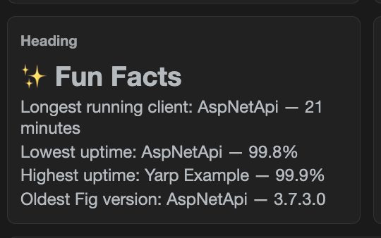
One or more lines with independent size, colour, alignment, and weight—useful for large uptime percentages with a caption.
Expected return
{
  lines: [
    {
      text: string,
      size?: 'xs' | 'sm' | 'md' | 'lg' | 'xl' | 'xxl',
      color?: string,   // any CSS color
      align?: 'left' | 'center' | 'right',
      weight?: 'normal' | 'bold'
    }
  ]
}
Suggested scripts: Client count summary, Run sessions heading, Average uptime (24h).
const seen = {};
let sum = 0, count = 0;
for (let i = 0; i < fig.runSessions.length; i++) {
  const s = fig.runSessions[i];
  const key = s.name + '|' + (s.instance || '');
  if (seen[key]) continue;
  seen[key] = true;
  sum += (s.uptimePercent24Hr == null ? 0 : s.uptimePercent24Hr);
  count++;
}
const pct = count === 0 ? 0 : sum / count;
const color = pct >= 99 ? '#8fd18f' : (pct >= 95 ? '#f5c57a' : '#e89996');
return {
  lines: [
    { text: pct.toFixed(1) + '%', size: 'xxl', color: color, align: 'center', weight: 'bold' },
    { text: 'Average client uptime (24h)', size: 'sm', color: '#9aa0a6', align: 'center' }
  ]
};
Badge
Compact status pill.
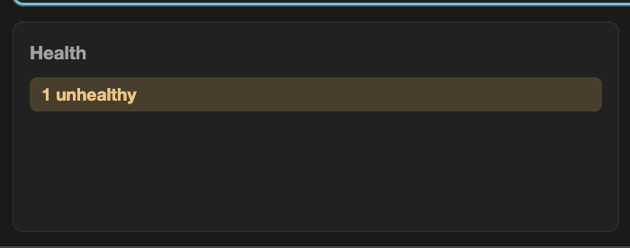
Expected return: string, or { text, variant? } where variant is info | success | warning | danger | muted.
const unhealthy = fig.runSessions.filter(s => s.health.status !== 'Healthy').length;
return {
  text: unhealthy === 0 ? 'All healthy' : unhealthy + ' unhealthy',
  variant: unhealthy === 0 ? 'success' : 'warning'
};
Bar chart
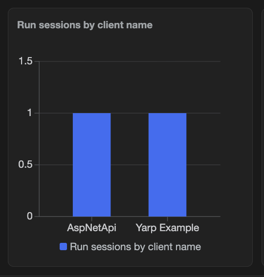
Expected return: [{ label, value }, ...].
Config: Legend — right | bottom | hidden.
return fig.runSessions
  .groupBy(s => s.applicationVersion)
  .map(g => ({ label: g.key, value: g.items.length }));
Donut chart
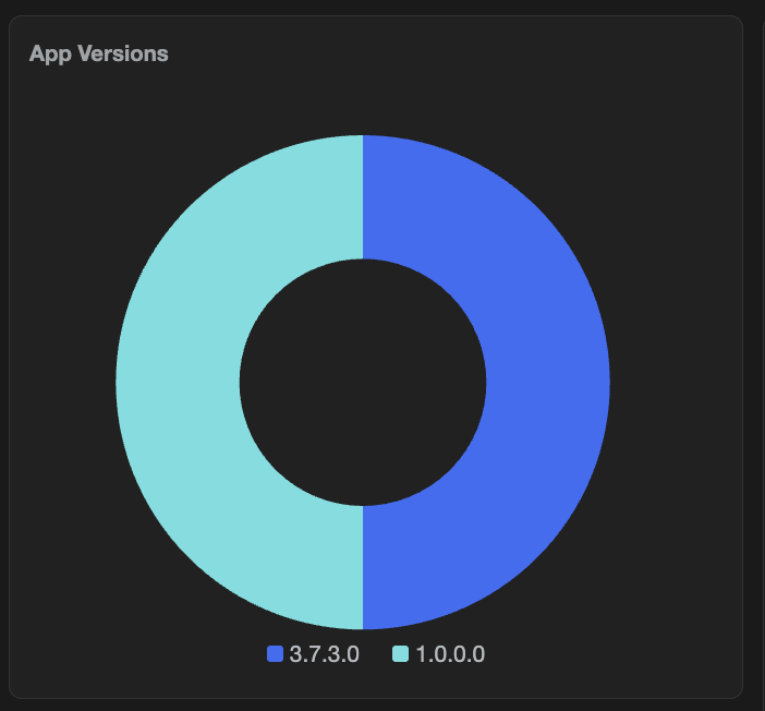
Expected return: same as bar chart — [{ label, value }, ...].
Config:
| Option | Values | Default |
|---|---|---|
| Legend | right, bottom, hidden | right |
| Chart size | large, small | large |
Use small when the donut sits beside dense cards so the grid row height stays compact.
return fig.runSessions
  .groupBy(s => s.health.status)
  .map(g => ({ label: g.key, value: g.items.length }));
Table

Expected return: array of row objects.
Config: columns in component config JSON (or via the table suggested script), for example:
{
  "columns": [
    { "property": "name", "header": "Name" },
    { "property": "hostname", "header": "Hostname" },
    { "property": "health", "header": "Health" }
  ]
}
If columns are omitted, keys are inferred from the first row.
return fig.runSessions.map(s => ({
  name: s.name,
  instance: s.instance,
  applicationVersion: s.applicationVersion,
  hostname: s.hostname,
  lastSeen: s.lastSeen,
  health: s.health && s.health.status
}));
List
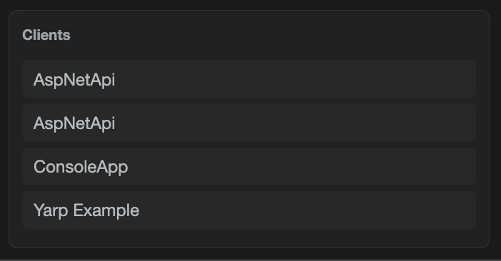
Expected return: string array, or [{ text|name, secondary?, variant? }].
return fig.runSessions.map(s => ({
  text: s.name,
  secondary: s.hostname || s.instance || ''
}));
Key / value
Bold keys with values; optional status circle (icon + colour) in the top-right. Icon and colour can be set from the script so they change with data.
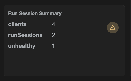
Expected return
{
  statusIcon?: string,
  statusColor?: string,  // CSS color
  items: [{ key, value }, ...]
}
// or [{ key, value }, ...]
// or a plain object (each property becomes a pair; statusIcon/statusColor reserved)
const unhealthy = fig.runSessions.filter(s => s.health.status !== 'Healthy').length;
return {
  statusIcon: unhealthy > 0 ? 'warning' : 'check',
  statusColor: unhealthy > 0 ? '#f5c57a' : '#8fd18f',
  items: [
    { key: 'clients', value: fig.clients.length },
    { key: 'runSessions', value: fig.runSessions.length },
    { key: 'unhealthy', value: unhealthy }
  ]
};
Cards
Responsive grid of compact status cards (title, large value, optional icon, optional key/value rows). Colour applies to the value and icon, not a full-card fill.
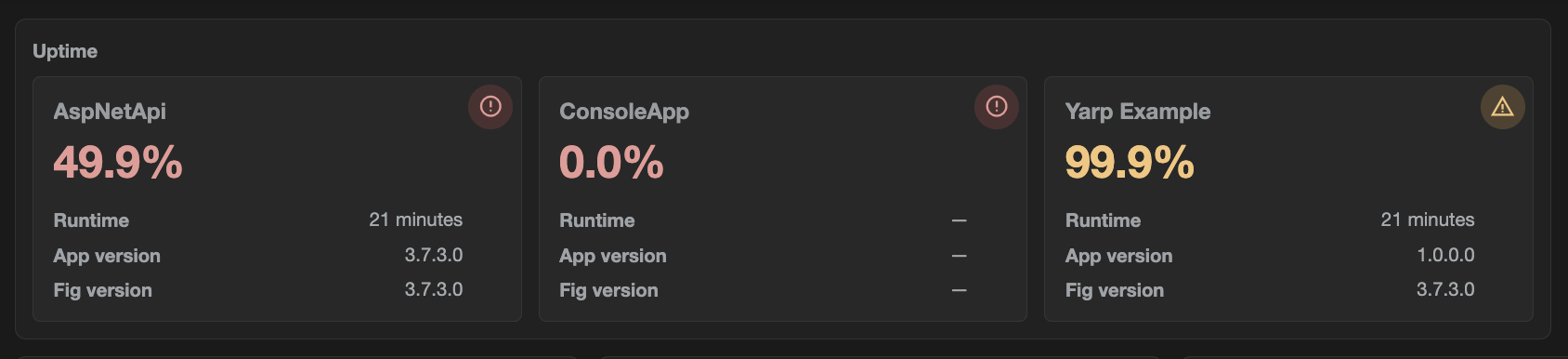
Expected return
[
  {
    title?: string,
    value: any,
    variant?: 'normal' | 'info' | 'success' | 'warning' | 'danger',
    icon?: string,
    rows?: [{ key, value }]
  },
  ...
]
Config — Card style: compact (default) | wide | extraWide (wider cells for long values such as timestamps).
Suggested scripts: All clients overview, All clients uptime.
// All clients overview (running/expected + detail rows)
return fig.clients.groupBy(c => c.name).map(g => {
  const instances = g.items;
  const expected = instances.length;
  const sessions = fig.runSessions.filter(s => s.name === g.key);
  const matched = instances.map(inst =>
    sessions.first(s => (s.instance || '') === (inst.instance || ''))
  ).filter(s => s != null);
  const running = matched.length;
  const appVersions = matched.map(s => s.applicationVersion).filter(v => !!v).distinct();
  const figVersions = matched.map(s => s.figVersion).filter(v => !!v).distinct();
  const longest = matched.sort(s => s.startTimeUtc).first();
  let uptimeSum = 0;
  for (let i = 0; i < matched.length; i++) {
    const pct = matched[i].uptimePercent24Hr;
    uptimeSum += (pct == null ? 0 : pct);
  }
  const variant = running >= expected ? 'success' : running > 0 ? 'warning' : 'danger';
  return {
    title: g.key,
    value: running + '/' + expected,
    variant: variant,
    icon: running >= expected ? 'check' : running > 0 ? 'warning' : 'error',
    rows: [
      { key: 'App version', value: appVersions.length === 0 ? '—' : appVersions.length === 1 ? appVersions[0] : 'Multiple' },
      { key: 'Runtime', value: longest && longest.uptimeHuman ? longest.uptimeHuman : '—' },
      { key: 'Fig version', value: figVersions.length === 0 ? '—' : figVersions.length === 1 ? figVersions[0] : 'Multiple' },
      { key: 'Uptime %', value: matched.length === 0 ? '—' : (uptimeSum / matched.length).toFixed(1) + '%' }
    ]
  };
});
Scripting workflow
- Select a component and choose a Suggested script (or write your own).
- Open the edit dialog for Monaco IntelliSense (
fig.completions, expected return type). - Click Evaluate to run the script and refresh the preview / canvas result.
- Use Data explorer to confirm property names and copy paths.
- Optionally Copy AI prompt, get a script from an external model, paste it in, then Format.
- Save the dashboard.
Scripts must return the shape the component expects. For example, a key/value component that returns { name, instance } without key/value pairs or items will render empty even if Evaluate shows JSON.
Refresh
Configured under dashboard Properties:
| Setting | Default | Meaning |
|---|---|---|
| Status seconds | 60 | How often run-session / status data is refreshed while the dashboard is open |
| Settings seconds | 600 | How often client settings data is refreshed |
Manual Refresh status / Refresh settings on the view page bypass the timers. Data explorer Refresh reloads both.
Import and export
On the Import / Export page:
- Dashboard Export — downloads all dashboard definitions as JSON (no live data or secrets).
- Dashboard Import — creates new dashboards only (never overwrites). Name collisions are renamed with
(imported).
You can also Export HTML from an individual dashboard’s view page for a static shareable snapshot.